Inkwell & co.
Inkwell & Co. is a bookstore specializing in antique and rare books. They've cultivated a really unique atmosphere that's beloved by literary enthusiasts and academics.
Mandate
Inkwell & Co., located near a university, wanted to expand its reach and attract a younger crowd while still keeping its loyal existing customers happy. The goal with this brand redesign was to bring in that new generation of readers without alienating the book lovers who already cherish Inkwell.
Design Thinking
I noticed that a lot of contemporary brands are embracing a clean, simple aesthetic with flat vector graphics. I drew inspiration from that trend, but I also wanted to make sure the design subtly nodded to Inkwell's focus on antique books. It was all about finding the right balance.
Design Making
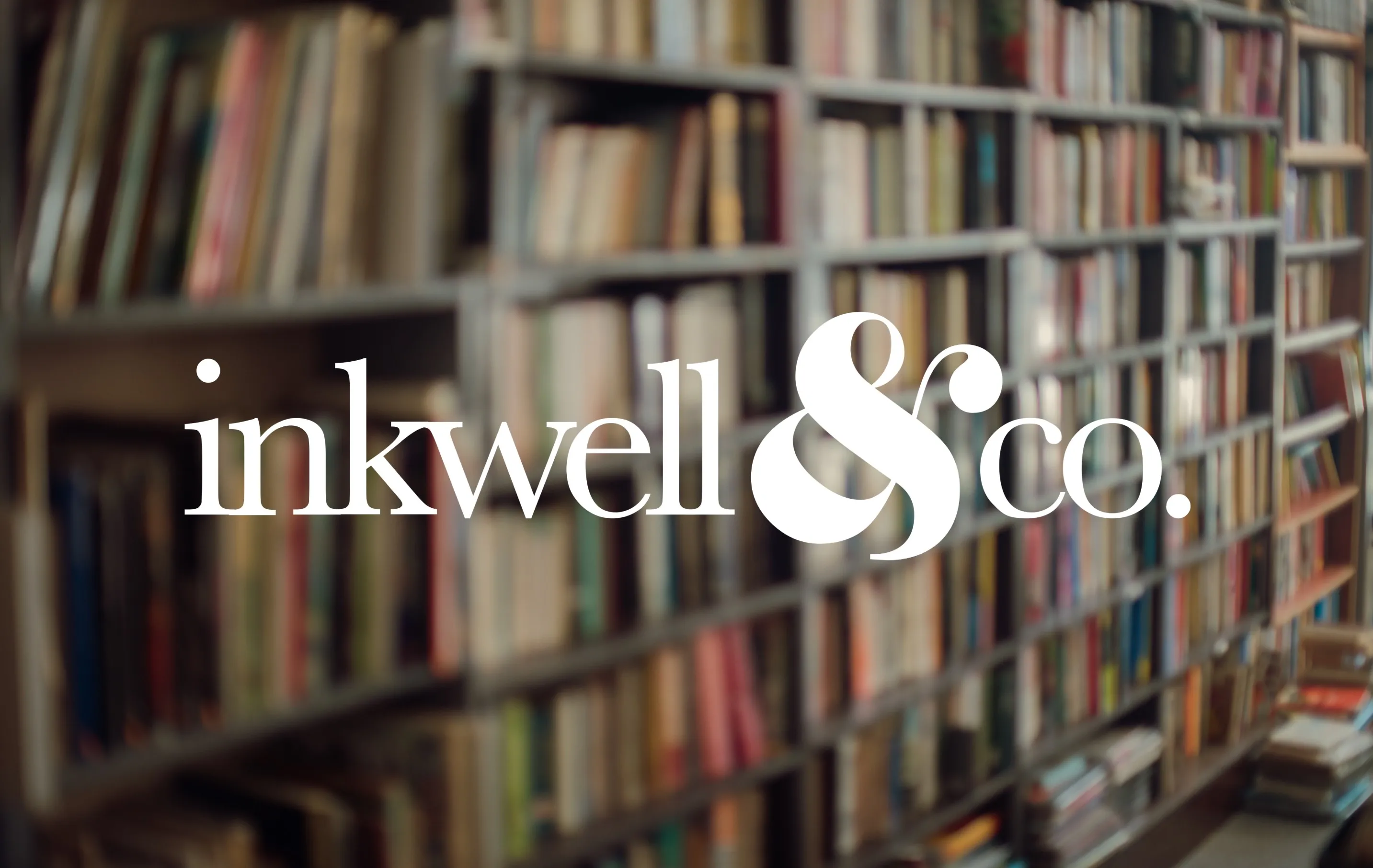
Since Inkwell & Co. is all about the written word, I decided that a typographical logo was the way to go. The ampersand, with its dynamic and flowing shape, became my central focus. It's a symbol that feels both modern and timeless. I paired it with Baskerville, a typeface that I felt was particularly well-suited to this project. Baskerville is a transitional typeface, which means it sits perfectly between Old Style and Modern. It felt like the ideal way to capture the blend of old and new that Inkwell embodies.


old books, new stories.
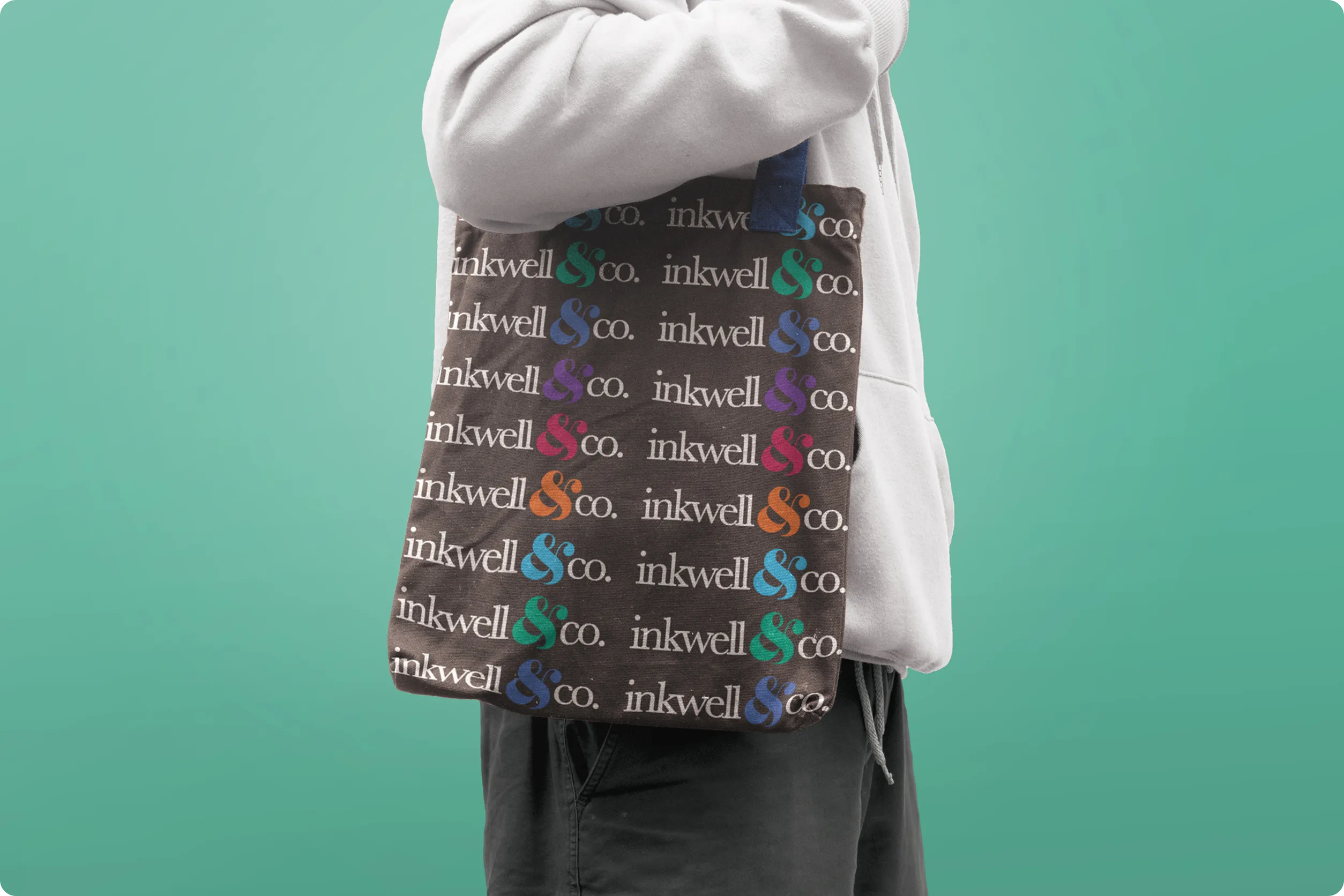


Inkwell has a six-colour system for organisational purposes, but also to change pairs of colours of the six based on the season.
