MPM
The Marchés Publics de Montréal (MPM) are a network of vibrant public markets offering a diverse array of fresh, local produce, artisanal goods, and Québec specialities. They're a great way to support local farmers and producers and soak up the city's atmosphere. With 12 markets under their management, they’ve been around and thriving since 1993.
Mandate
The MPM was looking for a branded line of products, starting with themed seeding kits for user involvement and a way to take a bit of the market home with them. After that, I was tasked with designing packaging for small pies which were derived from said seeds to fit within the line they’d established.
Design Thinking
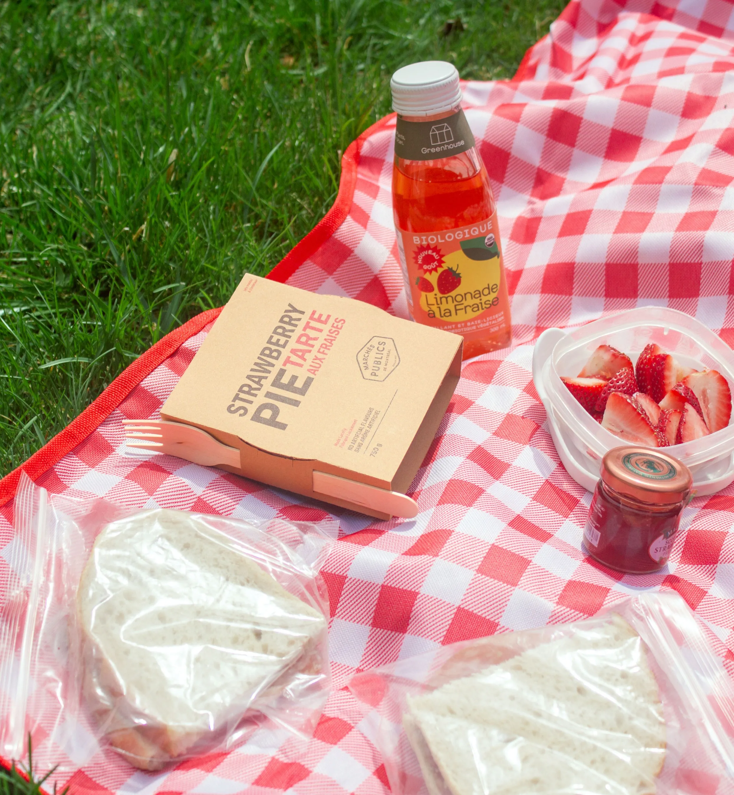
Small pies are more easily portable, and you'll likely be walking around in a market (or even just in the city). It was decided that these pies could be designed to be easily eaten on the go, making them a nice snack while out or something one could sit down and eat at home if preferred. The packaging would aim to reflect the feeling of being in the market, reaching for a natural and personal feeling with a dash of earthiness.
Design Making
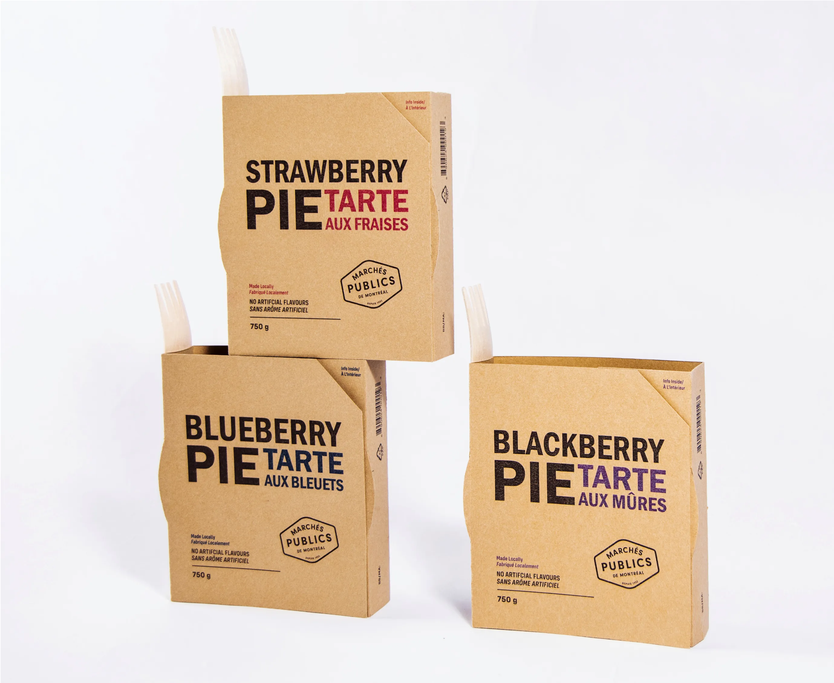
One of the most prominent choices in design was to use a unique paper that would give the packaging some light texture and both look and be ecological. This fits in with the general atmosphere of the markets. The design was simple and purely typographic to make it calmer and not overwhelming, and the type would be given a textured look when printed on the paper. The dieline is intentionally designed to be open both to fit a fork and have a takeout look, but also to make it more inviting and limit paper consumption.


The type size of the different words in the titles are intentionally varied across the three boxes both to keep a sense of similarity between them and to have a fun and dynamic design.